Monday, December 7, 2009

Atlanta Printmaker's Studio Open House

APS Open House was good this year, food, wine, education, and tons of awesome art for sale.


I bought this print:


It was part of a series they did last year called, "The Art of Democracy." I added it to my slow growing poster wall:


Thursday, December 3, 2009

Monday, November 30, 2009

Sunday, November 29, 2009

SAVOR & SWILL

The header/logo for my spread:


Since I made up my own recipe for the turkey burgers, I wanted to pair it with a great beverage to support it's unique taste. Michelle and I had a sake bloody mary when we were in Brooklyn-it was the best thing I've ever drank, so I thought it would make my burger look really good.

Photo from Michelle's Facebook

Cooking w Jobekel - Turkey Burgers


1 lb ground turkey
1/3 c olive oil
6 grape tomatoes, sliced
1/2 c diced onions
1 chopped garlic clove
1/2 tbsp chopped fresh parsley

Heat garlic, onions, & olive oil in skillet over med-lo 4-5 min.
In bowl, mix garlic, oil, & onions with turkey & tomatoes..
Divide final mixture into four equal, circular parts.
Cook in same pan over medium-lo heat.

Finished when crisp on both sides.


Self Portrait

Since school is my life right now, I want my portrait to express how it makes me feel. The feeling of not knowing where I'll be after graduation, a sort of lost feeling that it gives me. And even though there are those feelings of being sort of lost, I am also excited and ready to get out there and be scared, ready to start looking for a job, a place in the design world that is not as a college student anymore. I want this to look very graphic designy, yes that's a word.

Friday, November 13, 2009

Tuesday, November 3, 2009

T-Shirts Didn't Fly...

But that's okay, b/c they've been made before apparently...

http://www.zazzle.com/shell_yeah_blue_tshirt-235860986418275105

Monday, October 26, 2009

3 Posters and a Mailer

Mailer: Back. Last years mailer seemed like it had the back upside down, I chose to correct it so it reads more like a greeting card on both sides.


Mailer: Front


Posters:


Corrected Photos

The original pictures are on the left, corrected on the right.


As you can see, I chose to leave the pastel color on the blocks. By adjusting the levels though, the color isn't so faded, also the natural state on the wood is really highlighted, making it much more interesting to look at.


In the edited photo, I put three M's in a row to add depth and perspective. This is meant to simply add more interest in the photo.


As with all the photos, I tilted the letter to add perspective, this again, makes it much more interesting to look at.


Some of these photos can still use some work with the clone stamping, but overall, you can see where I'm going with the treatment. Some of the edges look a little jagged because they are screenshots form Illustrator, and you know how photos look in illustrator, not as crisp until they print.

Camp MODA Photo Shoot

Still playing with settings on my camera. I was planning on shooting with GRD's light box and DA's D80 in class today, but since the deadline got moved up, I had to use my resources. I was going to come in on sunday, bc our wonderful teacher (shout out to Stan the man) was going to let me do that, but scheduling was problematic... Anwyay, I did the best I could, and with some color correcting of the photos below, I will be able to come up with better pics.


Designing with Legos

Photography: Chia Lin Wong
Lego Design: Justin Godbey
Model: Mario Segarra


Thursday, October 22, 2009

Logo for JFRS


Here is the black and white version for the Jewish Federation for Research Science

Friday, October 16, 2009

Accidental Logos

Maybe these fake companies will form out of thin air and hire me to do their logo...


Tuesday, October 13, 2009

Beadtoberfest


I've come to terms with losing the legos in my poster. Because I am not using legos, I will not use the building blocks either. The next concept is "CAMP" out of beads. I would like to think of a way to incorporate environmental Coke, but I'm no really sure what activities are involved in that. For some reason I chose to start with the last letter. P is done, I would like to knock out the other letters soon so I can photograph them and get working on poster designs. I also need to work on a secondary idea in case this one doesn't work out. A type poster probably.

Saturday, October 10, 2009

My Weekend at the Lake


Bloody mary, beads, blocks, legos, a macbook, and a lake. What more could you ask for?

I just read though, that Camp MODA will not have legos as an activity. That is not good news for my poster design because I wanted to spell "Camp" out of different objects. See above, the lego M, I was going to do a learning blocks A and a cool beads P. Maybe I will do it all out of beads now??

Damn...

Wednesday, October 7, 2009

An Odd Connection

The Sunil's Home website, that John Milam and I designed, was featurd on Perez Hilton's blog this morning. A very odd connection, but great exposure for the charity.


Check out the comments, they are very interesting

Wednesday, September 30, 2009

Wine & Roses Gala 2010 : A Benefit for the Cystic Fibrosis Cure

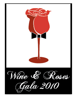
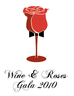
The Wine and Roses Gala is an event that happens once a year. It is a black tie event with dinner, a silent auction, and of course, wine and roses. I believe the roses are used as part of the silent auction and as an overall elegant theme to the event. It raises a lot of money that goes towards the cure of Cystic Fibrosis. YOU can be part of the silent auction! If you would like to put your out into the world, get a line on your resume, and raise some money by doing something you enjoy, you should consider donating a piece to the auction. Painting, drawing, ceramics, a basket of one-of-a-kind pieces (including maybe a 13month typographical calendar). If you ar eintersted please contact me, so many would appreciate your support-and spread the word!

Anyway, below are 4 uses of the logo I created for the event. Shauna, Michelle, John, and Nathan helped me with color choice, so thanks for that guys! I think these will look grat on signs, auction forms, etc. I hope it is clear what it is, but in case it's not, it's a wine glass/rose.


Tuesday, September 29, 2009

MODA Cards

Three poster concepts created three logos with similar layouts. They are each combined with the existing MODA logo. I plan to place these, bottom centered, on the back of the greeting cards.


There will also be, on the back, a small, 8 pt explanation of the concept, similar to the MODA holiday card we saw. Below, is the explanation of the bird concept. You will also see a pattern, inspired by the lovely and talented Shauna Perry, made out the bird.