Monday, October 26, 2009

3 Posters and a Mailer

Mailer: Back. Last years mailer seemed like it had the back upside down, I chose to correct it so it reads more like a greeting card on both sides.


Mailer: Front


Posters:


Corrected Photos

The original pictures are on the left, corrected on the right.


As you can see, I chose to leave the pastel color on the blocks. By adjusting the levels though, the color isn't so faded, also the natural state on the wood is really highlighted, making it much more interesting to look at.


In the edited photo, I put three M's in a row to add depth and perspective. This is meant to simply add more interest in the photo.


As with all the photos, I tilted the letter to add perspective, this again, makes it much more interesting to look at.


Some of these photos can still use some work with the clone stamping, but overall, you can see where I'm going with the treatment. Some of the edges look a little jagged because they are screenshots form Illustrator, and you know how photos look in illustrator, not as crisp until they print.

Camp MODA Photo Shoot

Still playing with settings on my camera. I was planning on shooting with GRD's light box and DA's D80 in class today, but since the deadline got moved up, I had to use my resources. I was going to come in on sunday, bc our wonderful teacher (shout out to Stan the man) was going to let me do that, but scheduling was problematic... Anwyay, I did the best I could, and with some color correcting of the photos below, I will be able to come up with better pics.


Designing with Legos

Photography: Chia Lin Wong
Lego Design: Justin Godbey
Model: Mario Segarra


Thursday, October 22, 2009

Logo for JFRS


Here is the black and white version for the Jewish Federation for Research Science

Friday, October 16, 2009

Accidental Logos

Maybe these fake companies will form out of thin air and hire me to do their logo...


Tuesday, October 13, 2009

Beadtoberfest


I've come to terms with losing the legos in my poster. Because I am not using legos, I will not use the building blocks either. The next concept is "CAMP" out of beads. I would like to think of a way to incorporate environmental Coke, but I'm no really sure what activities are involved in that. For some reason I chose to start with the last letter. P is done, I would like to knock out the other letters soon so I can photograph them and get working on poster designs. I also need to work on a secondary idea in case this one doesn't work out. A type poster probably.

Saturday, October 10, 2009

My Weekend at the Lake


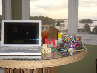
Bloody mary, beads, blocks, legos, a macbook, and a lake. What more could you ask for?

I just read though, that Camp MODA will not have legos as an activity. That is not good news for my poster design because I wanted to spell "Camp" out of different objects. See above, the lego M, I was going to do a learning blocks A and a cool beads P. Maybe I will do it all out of beads now??

Damn...

Wednesday, October 7, 2009

An Odd Connection

The Sunil's Home website, that John Milam and I designed, was featurd on Perez Hilton's blog this morning. A very odd connection, but great exposure for the charity.


Check out the comments, they are very interesting