Thursday, June 11, 2009

Pictures added to Borchure

I had to swap out the student center logo with the Division of Student Affairs logo. This hurt the design because it was smaller. To fix that issue, I added type, ..."welcomes you to GSU". That caused a problem to though, all the the type on the front was blue, and it bleneded together. There was no hierarchy or separation at all. So to fix that, "Your Spot for All Access" is now green.
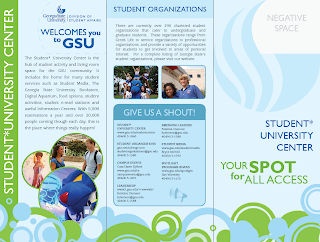

I added pictures to the inside, and tweaked the text so it would fit well inside straight edges. The block look lends itself well to brochures. I already notice some rivers, so I will have to fine tune some more. Hyphenation is not allowed per management...

Is it okay that there is negative space next to the negative space on the top left?


Tuesday, June 9, 2009

Student*University Center Brochure

For Incept, which has already started :/, I'm making  a brochure highlighting the main functions of the Student Center. I kept it lively with a bright color palette and repetition of spots. I also am planning a die cut, playing off the shape of GSU's infamous flame. On the inside panel, you'll notice a light-blue, dashed-line; this line represents what will be revealed through the die cut on the the front panel. I think this side is pretty much complete, maybe minor revisions, tweaks. One tweak being the copy, "You spot for all access" I don't know if all access flows very well... Your spot for.....??

(FULLY UNFOLDED)
INSIDE PANEL  -  BACK  -  FRONT


The next side, the inside, is just waiting on pictures. Once I put the pictures in, the type layout will probably change. As you can see, the spots stay consistent to keep it lively and fun, but the background color shifts to a pal green for a bit of contrast.

INSIDE (FULLY UNFOLDED)


Thursday, June 4, 2009

Man Down, Man Down!

We submitted the flyer to the head design honchos, and suffered a major casualty. We lost an entire side of the flyer. No that we're down to one side, this is what I came up with.


It still gets the message across, but I will miss the sea lions for sure.

Final Campus Event Logo

Similar to an existing GSU logo, Pounce's new smile and thumbs up, along with a couple heavy strokes to add depth to the circle, create an energetic mark. With this official seal, Pounce gives a new attitude to Campus Events; a fun, clean, cool, happy image. The university color palette lends itself well to this mark, giving it even more of an official attitude.


GSU Night at the Aquarium : Save the Date Card

GSU is having their second "GSU Night at the Georgia Aquarium" in the fall, and they want to make a 'save the date card' to hand out at Incept.  With images made public from the aquarium, below is what i came up with. 

FRONT


BACK


I wanted to stay playful and fun with this because it is an event that is supposed to be fun, duh. So, I placed the type in a way that interacts with the animals in an energetic way.

Tuesday, May 26, 2009

JoeBuckel.com Web Intro

Below is a very lo-res version of the first part of the 1.5 min long intro I am creating for my website. The idea is for my logo to ride through a world of my work, and at the end, the forms will come together to form my logo. This will be a 2D animation.

Monday, May 18, 2009

Plastic Surgery For Pounce

I redesigned Pounce's hand, to make the strokes the same style/weight as his head. Next step, color. Which way should he face?

Some guy critting university logos. Look at he says about GA State; it's insulting, yet funny.


Friday, May 15, 2009

More Campus Events Logos + Revisions


This one uses the same sort of treatment as a stamp or official seal. It plays off the existing panther logo, but replaces his hand gesture with a thumbs up. I also gave him a big happy smile to, again, connect Campus Events with fun and happy.


The next logo uses a classic microphone. I think classic throwbacks are kind of in right now, vintage. The microphone itself relates well to a lot of the speakers that Campus Events brings to GSU. (Ben Stein, RFK Jr., Soledad O'Brien, etc.)


The next four are revisions of the original, safe logo I did first (see that here). These logos are more playful, lively versions, using subtle, abstract curves in the letters. It also creates a unique mark using the C and the E. In theory, this logo would have 3 different versions. One with "Campus Events" stacked, the other with "Campus Events" spelled out long, and the third would be just the C and the E.


Friday, May 8, 2009

Awesome Sports Drink Ad

IDEAS : Campus Events Logo

For my job at the GSU Student*University Center, I am creating a logo for Campus Events. Below are some ideas. Overall, I am trying to give them something different form the other campus organization logos (Spotlight, etc.) I am hoping to inspire a little more creative freedom to be introduced into GA State's graphic design. Let's see what happens...

First is a kind of safe logo, a stamp sort of. Here I use the C and the E and the way they relate to one another.


Next, we get more playful. Here, I want to use a summer camp kind of feel to connect Campus Events with fun; who would want to go to a boring event, right?


Next, I portray Campus Events as more of an official organization, and it is very easy to take it seriously. In an attempt to make it not so serious though, this little guy comes with it.  "C.E. Vents" has potential to be used in ads as a way to present the event information. He can be dressed up, down, etc.


Similar to the camp sign logo, this logo connects happy times to Campus Events. What better way to do that than with a smile? This logo was definitely inspired by Justin's logo for The 2009 Miracle House Memorial Day Summer Kick Off.


Friday, April 17, 2009

"Drawn to Heroism" - Key Art 09

Below is my entry into the Key Art Awards 09. The concept is very straightforward, like the title, Drawn to Heroism. The drawn out logo and figure pay tribute to the idea of handmade/construction- like how Tony Stark constructed the Ironman suit. Placed behind the illustrations, photographs of the logo and Ironman add depth and color.

The Photo in the Background
The explosive content represents the high activity and drama in the movie while the calming palette keeps a serious mood to portray Ironman as a noble, heroized figure. It also supports the idea that the poster is a work of art.

Wednesday, April 15, 2009

Ironman Logo

To create a cohesive poster design, I am need to treat the logo with a palette and texture similar to the drawing style. 

Draw:


Cut background out, add the missing "N"


Color Overlay:


Magic Wand to take take out some color and reveal drawn texture and depth:

Ironman Inspiration Exercises

I tried physically combining the two subjects to see the possibilities of my concept. Throughout the photography, I kept thinking that I may be able to use one of these photos (below:) as an element in the poster.


Ironman : Half-drawn Concept

I did some drawings last night of Tony Stark and Ironman. I want to play on the fact that they are the same being, so I tried a drawing of them in half/combined too. See below, the drawings were done in order they are shown.


Tuesday, March 17, 2009

Wednesday, March 4, 2009

Revised Direction for Move Titles

The beginning, where it's black for a little while, and the violins are tuning, I will put the intro for columbia pictures, I just haven't figured otu how to rip it yet. Any ideas anyone? My DVD is encrypted...


The tuning in the beginning is applicable to the time period, violins are very much associated with the time period of the movie. Then, it begins to get comical with a silly voice asking, "are you ready?" Then, the mood totally shifts, when the formality is dropped, and the song, "my generation" begins. This is relevant to the way Marie Antoinette is portrayed in the movie, she is a blend of formal and fun, royal and party girl, etc. To reinstate this contradiction, I also use visuals, the somewhat elegant flourishes against clean type.

Friday, February 20, 2009

Please Note : I did NOT Make This

The reason this does not work is because the images have harsh, sharp edges, not visually appealing. Also, the way the pictures move around the screen, and the effects applied to them while doing so, seem like very basic filters, which limits the creativity in my mind.

The credits I will complete for the movie will be a similar concept, but a cleaner, sharper execution.

Final iTunes Ad for "Music of the Nineties"

I rearranged the type to make it more organized. The headline moved to the top to help with that. It's an easier read, from top to bottom, big to small.

New Movie Title Sequence : Marie Antoinette

You tube does not have the existing opening title sequence with audio, but at least you can see what it looks like here.


Saturday, February 14, 2009

iTunes Ad for "Music of the Nineties"

I'm having trouble deciding which one to go with. I'll sleep on it I guess. Either way though, the concept stays strong, and the product gets advertised, right?


Wednesday, February 11, 2009

Final Animated Type : Madea Vs. Ho


Concept for CD Ads

For the full page magazine ad for the cd, my idea is to focus on one object that was famous in the 90's, and show it listening to music through headphones. In theory, there will be a series of about 4 or 5 ads, but I will probably only make one. Mike and Zach helped me think of some great objects power rangers, furby, tamagotchi.  These are just rough, digital sketched of the ads. The final ad will be a photograph of the object, not these little illustrations.


Movie Title


I would like to open with the same exact audio. While the audio was playing, I want to show newspaper clippings, photogrpahs, and other records of Hannibal Lecter. The whol movie is about 3 main parties looking for Dr. Lecter; Clarice with the FBI, Clarice personally, and the deformed man, I forgot his name. Having said that, the newspaper clippings, record, etc. would be what Clarice or the defomed guy have as records/tracking of Dr. Lecter.