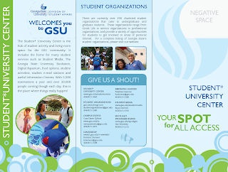
I had to swap out the student center logo with the Division of Student Affairs logo. This hurt the design because it was smaller. To fix that issue, I added type, ..."welcomes you to GSU". That caused a problem to though, all the the type on the front was blue, and it bleneded together. There was no hierarchy or separation at all. So to fix that, "Your Spot for All Access" is now green.

I added pictures to the inside, and tweaked the text so it would fit well inside straight edges. The block look lends itself well to brochures. I already notice some rivers, so I will have to fine tune some more. Hyphenation is not allowed per management...
Is it okay that there is negative space next to the negative space on the top left?


2 comments:
wow... nice looking stuff Joe. I'm used to seeing stuff for GSU that is borderline dreadful. The colors and layout are great... Only think I don't like about brochures is there is always so much info packed in you can't really have a lot of negative space.. I guess it's just the nature of the brochure sized document. You made this work really well...
Haha, true, a lot of GSU design is pretty dreadful. I am stuggling with fitting everything in in a way that is soothing to the eye, it makes it even harder with that die cut, but I really want the die cut int here.
Post a Comment