Tuesday, September 29, 2009

Plea for help

Black, white, or grey?

Saturday, September 26, 2009

Love Nests Concepting

Type creates a shape of love and endearment:


Bird sitting, as if on it's nest, with the eye as a camera. The lens as the eye shadows the saying, "The eyes are the window to one's soul" or something like that.


The boxes came from the idea of picture frames. Self portrait, camera.


Wednesday, September 23, 2009

Thursday, September 17, 2009

The Evolution of The Bird Poster

The first icon idea of the bird to allude to the nest, and the train to allude to keepsakes. Also, the experiment with a new tag line begins, Endearments Engineered. A way to sum up the show's theme in two words.


Enter the copy, MODA's official description of the show. Also, the line experiment begins as a way to hint at the engineered displays the photographs will take on at the show.


I try the MODA red to try to bring attention to the poster and stay true to MODA branding. This is where those sayings, too much of a good thing and less is more really shine through as true statements...


...so back to the white.


Next, we say goodbye to the lines and the new tag line. The structure concept gets put on hold until I maybe find another way to allude to it. The new tag line gets replaced with MODA's official tag line, or subtitle actually, Photographs and Objects.


Now, we introduce the camera as the heart concept. The show is about a person's endearments captured through The Portfolio Center Student's photography and displayed by the GA Tech Industrial Design students.

Person's Endearments + Portfolio Center Photography = Camera where the heart goes
GA Tech Industrial Design's Display = The close-up (display) of the enlarged heart/camera


Friday, September 11, 2009

Early Bird (Student) Gets The Worm (Muffins)

I designed this to get student's attention, but it was too formal, so then I designed the next one. Hope this one gets people to look...


Speaker Series 09-10 Style

The logo I created for Campus Events' Speaker Series 2009-2010. Campus Events has lined up 6 guest speakers this school year, pretty good ones too. The first is Jeff Corwin.


Below is the first ad of the series. It will serve as a template for every speaker's ad. I worked to really brand the Speaker Series this year by giving it a logo and stressing the importance of keeping all promotional materials stylistically consistent.


Gym Class Heroes Flyer


I started off submitting this one to Spotlight, but they pointed out that the important info jsut was not noticeable enough.


So then I used a very bright colors and a very noticeable font to make it stand out more, I think this one is more eye catching.


Saturday, September 5, 2009

Stream of Ideas for Love Nests

Potential copy that explains the exhibit:


Type idas, clean, maybe something to differentiate the words, besides a space:


Taking the title literal, I made nests out of the MODA logo. I thought that since there were photographs of sentiments in the show, that I would put photographs of keepsakes in the nests. The repetition makes the nests look like christmas wreaths though.


Then I started to think to go simpler because that is MODA's style. I liked the the idea of having sentiments though, so I took the same concept, but made it more abstract with icons Maybe the bird can be sitting on the icons (instead of a nest)


The first idea:


Wednesday, September 2, 2009

Tuesday, July 28, 2009

+ Yellow = Good?


New Spotlight Brochure

Here is the new Spotlight brochure. Just a reminder, after seeing the first one, they asked for pictures, trifold, and no "confusing typography"

FRONT


INSIDE PANEL (UNFOLDED ONCE)


INSIDE (UNFOLDED FULLY)


BACK

Tuesday, July 14, 2009

Spotlight Brochure


This brochure had some limitations:

Use black and gold
Use the horrendous Spotlight logo
8.5 x 11
Landscape
Center fold

Anyway, there's my disclaimer.

The bold, heavy type on the solid color serves as a reference to a spotlight. A spotlight exposes/draws focus to something; in this case, the type.

FRONT


INSIDE


BACK


For some reason, I like it better in print than in digital. I don't know why printing seems to help or hurt the design sometimes. I always feel like a piece looks either better on screen, or better printed out... is it just me?

Friday, July 10, 2009

The Best Comment Ever


Check out the comment someone left on my zazzle page about one of my t-shirts I sell on zazzle.com. It's awesome, he goes off about how expensive the shirt is and then out of nowhere compliments it. It's hilarious. On top of that, his sentences don't even make sense. Thanks for that zazzleblader and by the way, people buy the shirts, and zazzle takes 85% of the money...bastards... I may not get much for them, but the + side is, I get my work out there, people are wearing it somewhere. I would love to see someone on the street wearing one!

Thursday, June 11, 2009

Pictures added to Borchure

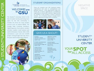
I had to swap out the student center logo with the Division of Student Affairs logo. This hurt the design because it was smaller. To fix that issue, I added type, ..."welcomes you to GSU". That caused a problem to though, all the the type on the front was blue, and it bleneded together. There was no hierarchy or separation at all. So to fix that, "Your Spot for All Access" is now green.


I added pictures to the inside, and tweaked the text so it would fit well inside straight edges. The block look lends itself well to brochures. I already notice some rivers, so I will have to fine tune some more. Hyphenation is not allowed per management...

Is it okay that there is negative space next to the negative space on the top left?


Tuesday, June 9, 2009

Student*University Center Brochure

For Incept, which has already started :/, I'm making  a brochure highlighting the main functions of the Student Center. I kept it lively with a bright color palette and repetition of spots. I also am planning a die cut, playing off the shape of GSU's infamous flame. On the inside panel, you'll notice a light-blue, dashed-line; this line represents what will be revealed through the die cut on the the front panel. I think this side is pretty much complete, maybe minor revisions, tweaks. One tweak being the copy, "You spot for all access" I don't know if all access flows very well... Your spot for.....??

(FULLY UNFOLDED)
INSIDE PANEL  -  BACK  -  FRONT


The next side, the inside, is just waiting on pictures. Once I put the pictures in, the type layout will probably change. As you can see, the spots stay consistent to keep it lively and fun, but the background color shifts to a pal green for a bit of contrast.

INSIDE (FULLY UNFOLDED)


Thursday, June 4, 2009

Man Down, Man Down!

We submitted the flyer to the head design honchos, and suffered a major casualty. We lost an entire side of the flyer. No that we're down to one side, this is what I came up with.


It still gets the message across, but I will miss the sea lions for sure.

Final Campus Event Logo

Similar to an existing GSU logo, Pounce's new smile and thumbs up, along with a couple heavy strokes to add depth to the circle, create an energetic mark. With this official seal, Pounce gives a new attitude to Campus Events; a fun, clean, cool, happy image. The university color palette lends itself well to this mark, giving it even more of an official attitude.


GSU Night at the Aquarium : Save the Date Card

GSU is having their second "GSU Night at the Georgia Aquarium" in the fall, and they want to make a 'save the date card' to hand out at Incept.  With images made public from the aquarium, below is what i came up with. 

FRONT


BACK


I wanted to stay playful and fun with this because it is an event that is supposed to be fun, duh. So, I placed the type in a way that interacts with the animals in an energetic way.