Saturday, January 31, 2009

Music of the Nineties : CD Cover


That's what I have so far, I'm thinking about calling it done. I designed based on the grunge music playlist and of course a David Carson inspiration.

Monday, January 19, 2009

Resume


I wonder if I am missing anything. Also, I wasn't sure whether or not to put The N Network on there, since we  have not started the project yet. I think it is such a good line on the resume though, so I included it.


Friday, January 16, 2009

Which is Awesomer?

You're right, "awesomer" is not a word. Having said that, which one is more awesome; the one that's way comic...


...or the one that's comic-ish?


Advertising for Durex

Caution, this video may be offensive to some, to me though, it is fantastic advertising!

A serious question though, is it too risky for the company? It is funny to some, like myself, but is it funny to the majority of consumers? Do people that buy condoms think this is funny? Do people that will not buy condoms think it is funny?

No question though, it is animated quite nicely.

Tuesday, January 13, 2009

Pixel


My friend just met someone who has a dog named "Pixel." Him and his wife are graphic designers. Thought that was cute. I don't know what he looks like, but I imagine him to look something like my illustration above.

Monday, January 12, 2009

Print & Editorial Work : Men's Health Redesign

2 Page Spread:


Table of Contents:


Cover 2 (with color)


Cover 1


The cover is still a work in progress....

Saturday, January 10, 2009

Madea

I love this movie. I'm thinking about doing a clip from here for my animated type piece.


If I do go with this one, I'll use a shorter sound byte

Wednesday, January 7, 2009

Movie Posters

http://www.fluid-studio.net/blog/wp-content/uploads/2008/08/m.jpg

The type treatment in this poster is great. I have no idea what the movie is, but what a great use of color, light, photography, everything.


The use of type in this poster is eye catching. The idea of being the last man on a big planet is portrayed through the large type and the huge sky/small person in the photo. The only criticism I have of this poster is that it may lead the viewer to believe that the movie is called The Last Man on Earth is not Alone, when in fact, it is I am Legend


The Dark Knight poster utilizes a great altered photo (or maybe rendering) and uses the classic movie type placement for the cast names. Color palette works well and gives a great feel for what the movie is like.

I think the poster below was a teaser poster, and it teases for sure. No face of the villain, a quiet, empty, mysteriously lit up street, and of course, the famous Batman logo. Also, it keeps with the color palette in the newer one poster (above)


How could I not put this in?


Movie Trailers

The music and decided video and sound bytes for the 300 trailer fit perfectly together. Well organized, etc.

.


The trailer for Everything is Illuminated captures the emotions of the movie. I watch the trailer, and remember how much I love the movie, and I remember exactly how I feel when watching the movie; that's what makes a trailer successful.


The Dark Knight trailer is well organzied, sound, video, everything. After seeing the movie a couple times, I see how much work went into the trailer. It reveals exactly enough plot, emotion, and special effect to provide interest, and accurately portray the film.


Monday, January 5, 2009

Sunil's Home Intro Page


I received great client and peer feedback, thanks guys, keep it coming whenever you want!

I have not done much with incorporating more colors, but I created a flash intro page. The rest of the pages will look the exact same as the intro page, but will actually be html.

Next step is incorporating video, and I am nervous/excited about that because I have no idea how to do it. After that, I will work on getting more colors in there as well. Lastly, the client was inspired my Skate Escape guy who appeared all over the identity, in case you don't remember:


The client requested a similar treatment with the stick figures from their logo, so I have some work to do with that as well. I'm thinking, one on each page? Maybe holding up a sign that serves as a button. We'll see.

Friday, January 2, 2009

Sunil's Home


I'm working on a web site redesign for an orphanage called "Sunil's Home." The guys are looking for a fresher look than the current site, but would still like to keep the "child drawn" look and all content will remain the same. Any feedback you guys have would be great, thanks!

The site I am working on can be viewed here.

Image from Sunilshome.com

Swisco


I made this logo for my friend in Nasville. His nickname was "Swisco" in college, his last name is actually "Sisco." I made the letter "w" smaller so you can read "Sisco" and "Swisco." The texture came from shattered glass. This image captures the Sisco I know.

Friday, December 26, 2008

Um, I don't know.


Look what the web designer did with the logo I designed:


That's what happens without a usage and application clause in the contract... drop shadows and Microsoft Word fonts. I feel violated....

Image from Migratingeye.com

They do good sites, but I wasn't pleased with this one.


Friday, December 12, 2008

Go for a Swim, or a Ride, in the Air

This one is great, beautiful, but a little confusing. I guess there's some sort of motor inside??


Air Art from flip on Vimeo.

This one is another beauty, but I recommend muting the sound because the song is quite piercing to the ears...


Wednesday, November 19, 2008

Dona Paula: Final Design Schematics


The final bottle design is made up of transfers and labels.


The package will be a box constructed of bristol board and a clear, acrylic top that will display the bottle's head. The rounded rectangles you see in the gray bristol, are cutouts revealing the logo on each side of the bottle.


Sunday, November 16, 2008

Atlanta's Rally Against Prop 8

Yesterday, I went downtown, just a couple blocks away from campus, and documented the protest against Prop 8. I created a movie compiled of photographs I took and sound bytes I recorded while there. It was a really moving demonstration, and in the video below, I tried my best to capture the emotion that was felt in the crowd.

Saturday, November 15, 2008

Current Design Trends

Current Design Trends include, distressed type and image, untraditional type including all caps or all lowercase, tributes to the 70's styles by use of color, silhouettes, and of course, flourishes! Some examples below:


Photo Credits (top to bottom): iTunes, YouTube.com, Premvishrant.Wordpress.com, Printmag.com, MisterShape.com

Get Inspired: FF to Next Semester

Some great opening credits


Friday, November 14, 2008

Final Bottle Design


I'm set on this, what do you think?

Thursday, November 13, 2008

New Junior Class Blog


John and Mike told me about Illustration Friday and decided to start up our own. We created a blog that will compile our classes work. Every week, there will be a word of the week, and we will each create an art piece of any medium to post every friday. This week, the word was fancy, next week, the word is paperclip. Check out the blog here.

Tuesday, November 11, 2008

Back in the Day

Last week, I went to The Scott Show, two huge warehouses just south of The Atlanta Airport, filled with antiques from private vendors. It's $5.00 for a 4 day pass. When I was there, I took pictures (with my camera phone) of some old graphic design, and such. Check it out.


Cool Job Opportunity


Artist: Pam Tanzey
Photograph: http://fromthecrowsnest.blogspot.com

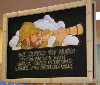
Trader Joe's in Midtown needs a sign artist, I think some people in the class could do very well at this job, check it out on Craig's List, and hurry, before someone else gets it.

Saturday, November 8, 2008

Progress Report: Dona Paula Malbec Redesign

The special edition bottle for the W is a fun idea, but it is coming off of the bottle since it steals attention from the DP logo. Below are a couple versions of the redesign. The purple comes from the color of a thistles. Los Cardos means The Thistles in Spanish. The presence of thistles on a vineyard suggest that the terrain is excellent for growing. This vineyard prides themselves on the presence of thistles around their vineyard; so much that they put it on the label.


Wednesday, November 5, 2008

Redesign for Special Edition Wine Bottle

This is kind of the 1st idea that has come across. Keep in mind that the restaurant's (BLT Steak) logo and the hotel's (W Hotel) logo will not be changed, only the logo for the wine is going to changed.


Below is the first attempt at the new logo for Dona Paula, and below is the existing logo.


I stayed with the dp initials for the logo because I saw it as a good opportunity for change without journeying too far away from the classic. I think the new logo serves very well as a distinct mark for the winery.